Case Study - 1

Campify

This camping supply store app offers a user-friendly platform for busy professionals and families to quickly find and buy quality gear, featuring intuitive navigation and efficient search for a seamless shopping experience.

My Process

UI/UX Design Process

Understanding The User

User Research

Project Overview
User Persona
User Journey

Creating Design

Designing

Wireframes
Low-Fidelity Prototype

Improving Design

Refining Design

Usability Study
High-Fidelity Prototype

Conclusion

Key Takeaways

Impact
What I Learnt

User Research

Project Overview

The Problem

Current camping gear shopping apps overwhelm beginners with unguided catalogs, causing decision paralysis and low confidence, while stores miss chances to build loyalty and repeat business.

Project Goals

The goal of the project was to design a user-friendly interface that simplifies the user journey, improves accessibility, and increases overall satisfaction.

Brainstorming

User Persona

Rashi is an avid outdoor enthusiast who loves exploring nature with her family. She works as a marketing manager at a tech company, giving her a solid grasp of technology. She takes time off from work and goes to numerous camping spots with her family for vacation.

“Rashi’s priority is balancing her work and personal life by quality time spent with her family when she is on vacation.”

  • Find durable and high-quality camping supplies that will last for multiple trips.
  • Discover camping gear suitable for both adults and children, ensuring safety and comfort.
  • Balancing a busy work schedule and family life leaves her little time for extensive research.
  • Often finds that websites are not well-optimized for mobile, making it difficult to shop on the go.
Designing

Paper Wireframes

Low - Fidelity Prototypes

Design Improvement

Refining Design

Usability Study

We conducted usability studies to evaluate the effectiveness and user-friendliness of our camping supply store app. The first round focused on identifying major pain points and usability issues, while the second round aimed to test the improvements made based on initial feedback.

First Round

Missing "Heart" icon made favoriting items tedious.

Small filter icon caused difficulty locating sorting options.

Missing search bar made it difficult for users to find products.

Usability Study

We conducted usability studies to evaluate the effectiveness and user-friendliness of our camping supply store app. The first round focused on identifying major pain points and usability issues, while the second round aimed to test the improvements made based on initial feedback.

Second Round

"Heart" icon gave users the ability to favorite products easily.

Clear filter button improved visibility and reduced search time.

Adding a visible search bar helped users quickly locate desired products.

High - Fidelity Prototypes

Conclusion

Key Takeaways

Impact

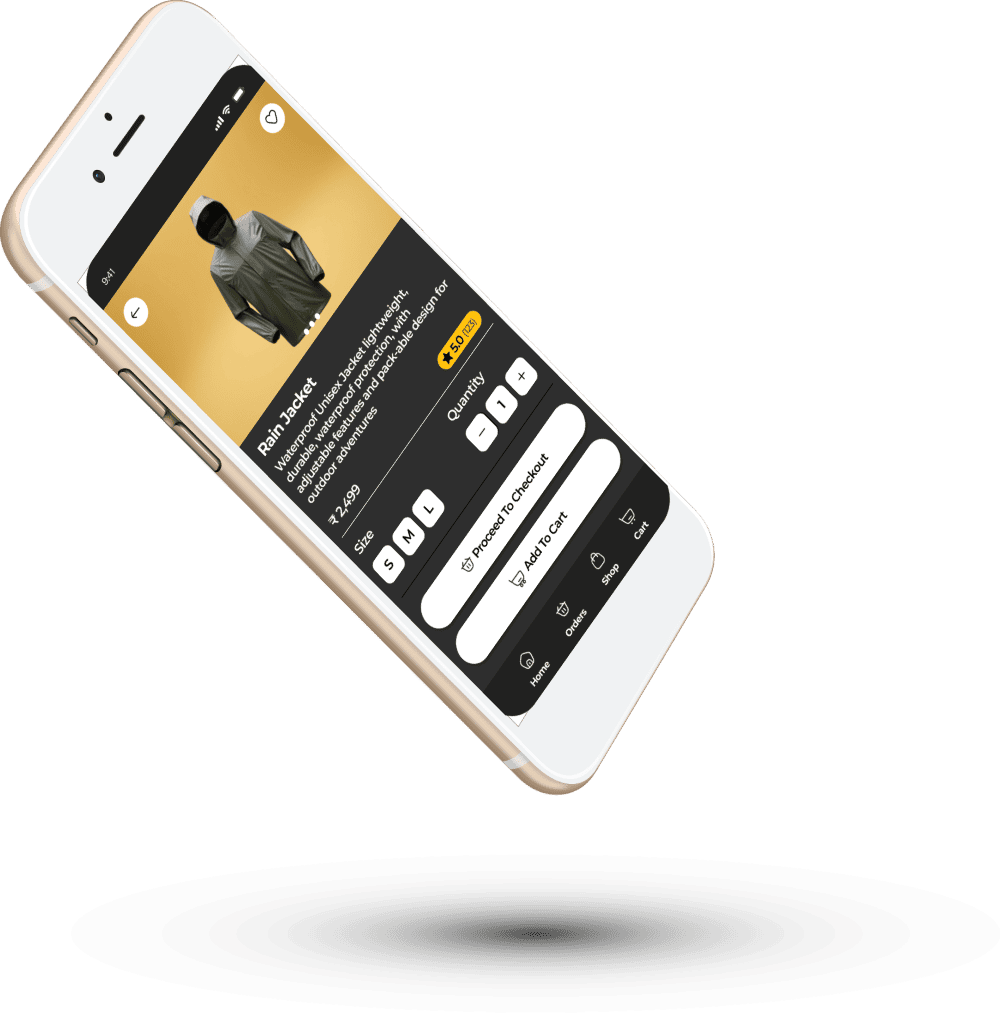
The redesigned camping supply store app has significantly improved user satisfaction by providing a seamless and efficient shopping experience on mobile devices. One participant noted, "I love how easy it is to find everything I need quickly, even when I'm on the go. It's a game-changer for my busy lifestyle

What I Learnt

Throughout this project, I learned the importance of deeply understanding user needs and pain points to create effective and user-friendly designs. Conducting user research and usability studies highlighted the necessity of optimizing for mobile platforms and ensuring seamless navigation for busy users.

Have Project in Mind?

Let’s Turn your Ideas
into Reality

Scroll to Top