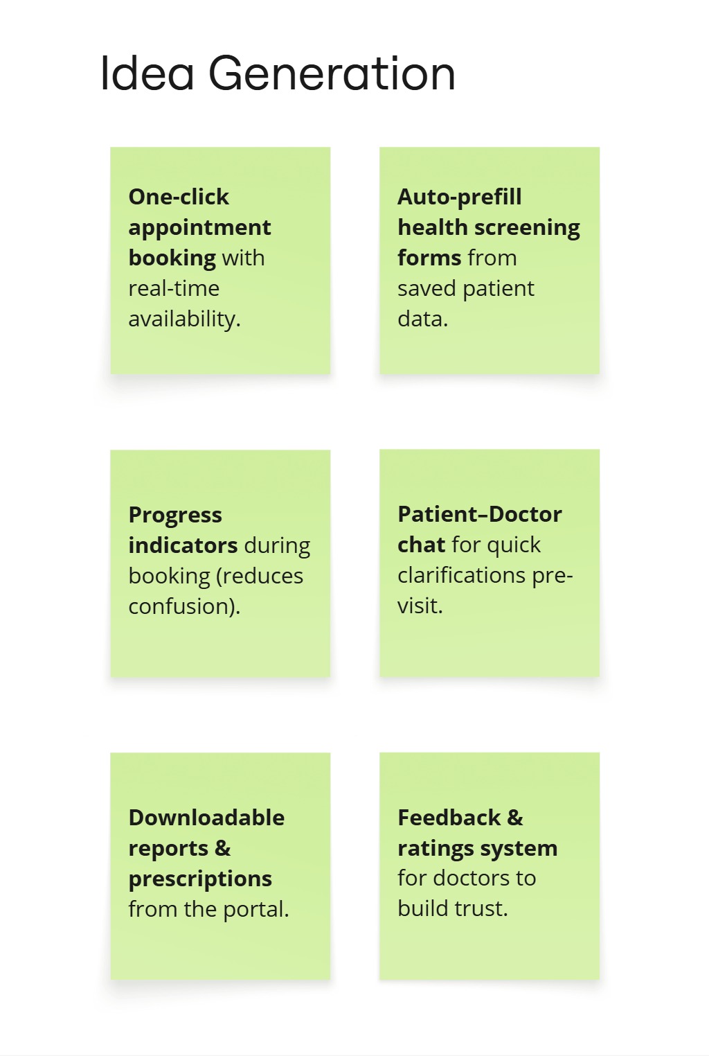
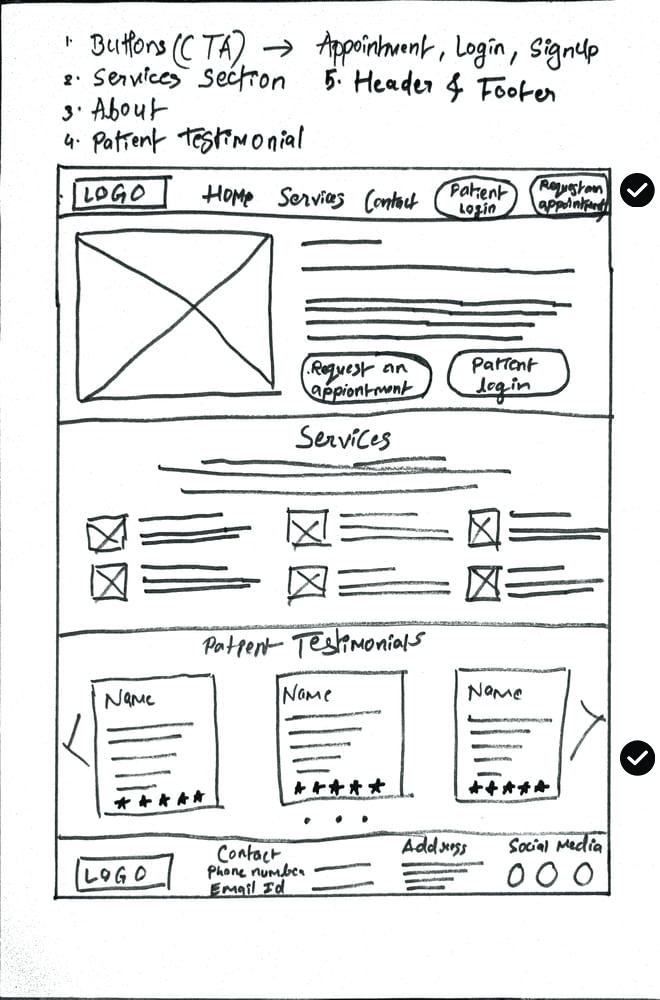
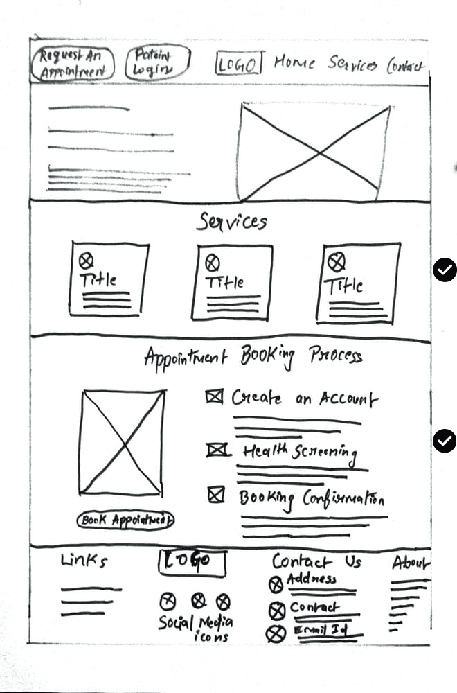
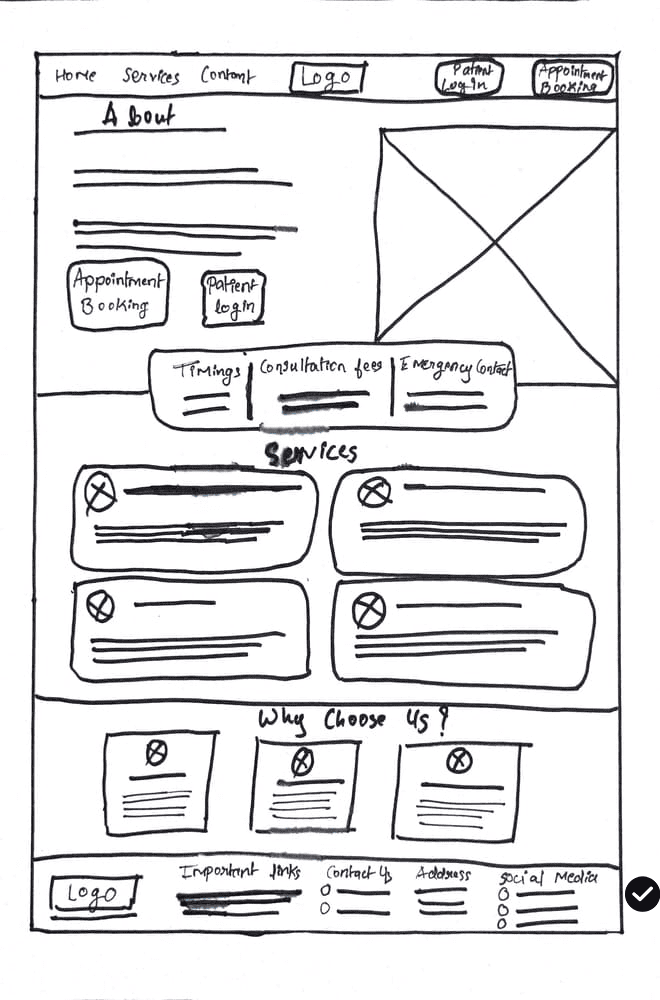
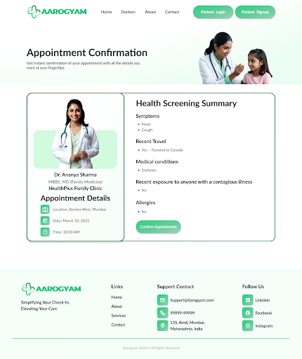
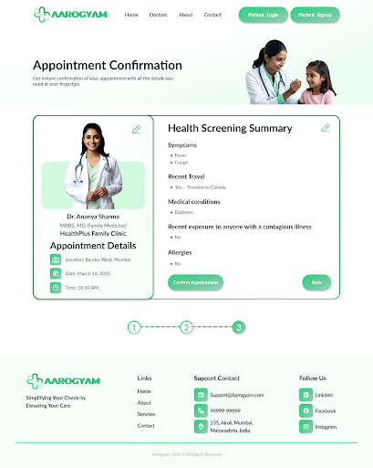
Case Study - 2
Aarogyam
Aarogyam is Patient Check-In Portal is a modern, responsive web application designed to streamline the check-in process at family doctor offices. It allows patients to register upon arrival, provide necessary health details, and receive real-time updates all from their personal devices.
UI/UX Design Process
Understanding The User
User Research
Project Overview
Brainstorming
User Persona
User Journey
Creating Design
Designing
Paper Wireframes
Low-Fidelity Prototype
Refining Design
Usability Study
Usability Study
High-Fidelity Prototype
Conclusion
Key Takeaways
Impact
What I Learnt
Project Overview
The Problem
The problem I was trying to solve was to streamline the patient check-in process and initial health screenings by creating a user-friendly, responsive website that reduces wait times and improves the overall patient experience at a family doctor's office. This solution also aimed to ensure accessibility and ease of use across various devices.
Project Goals
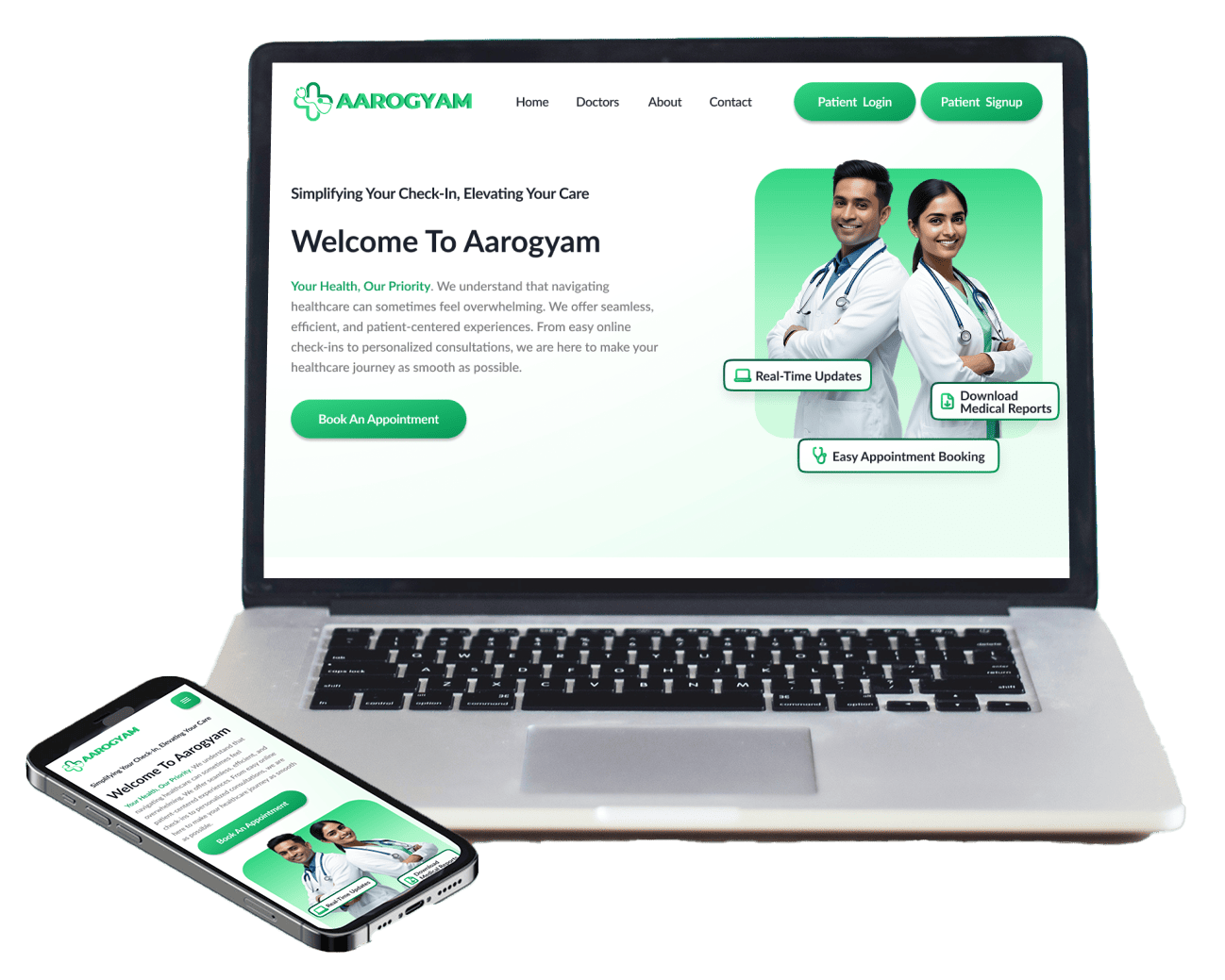
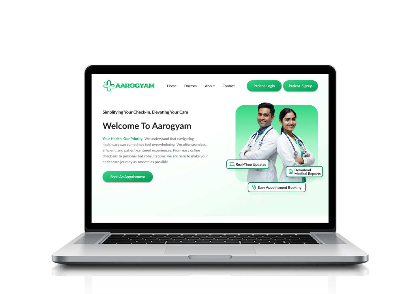
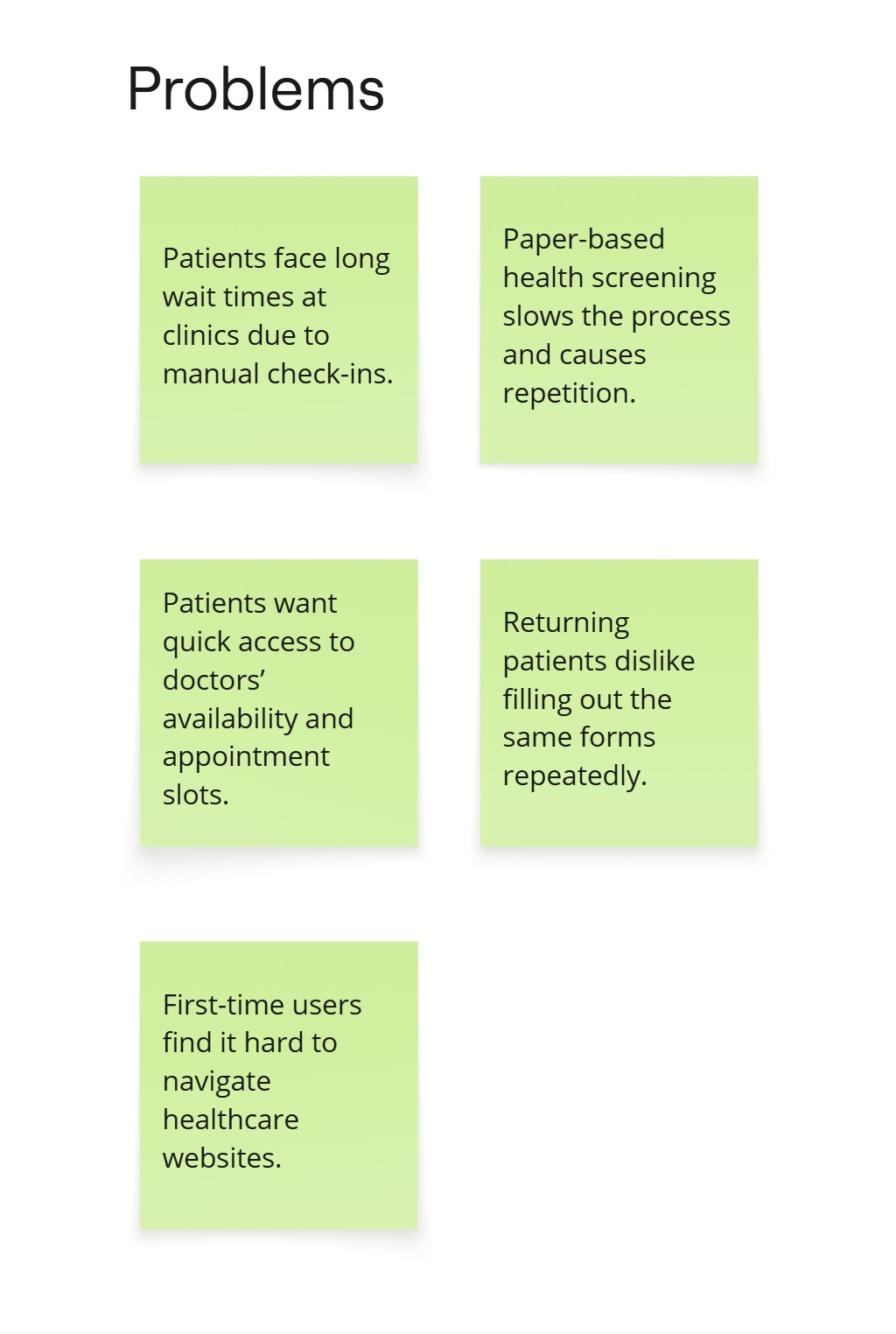
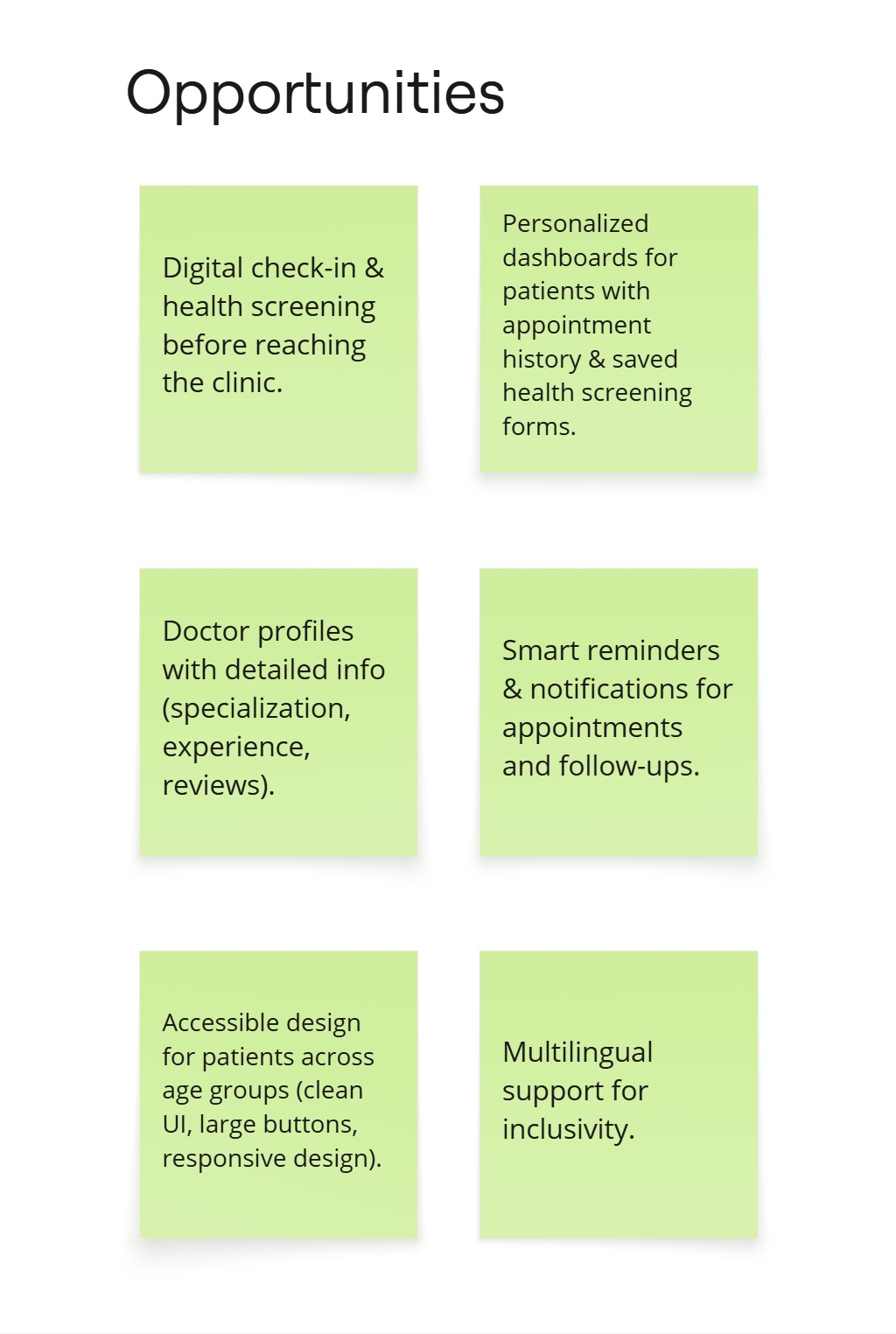
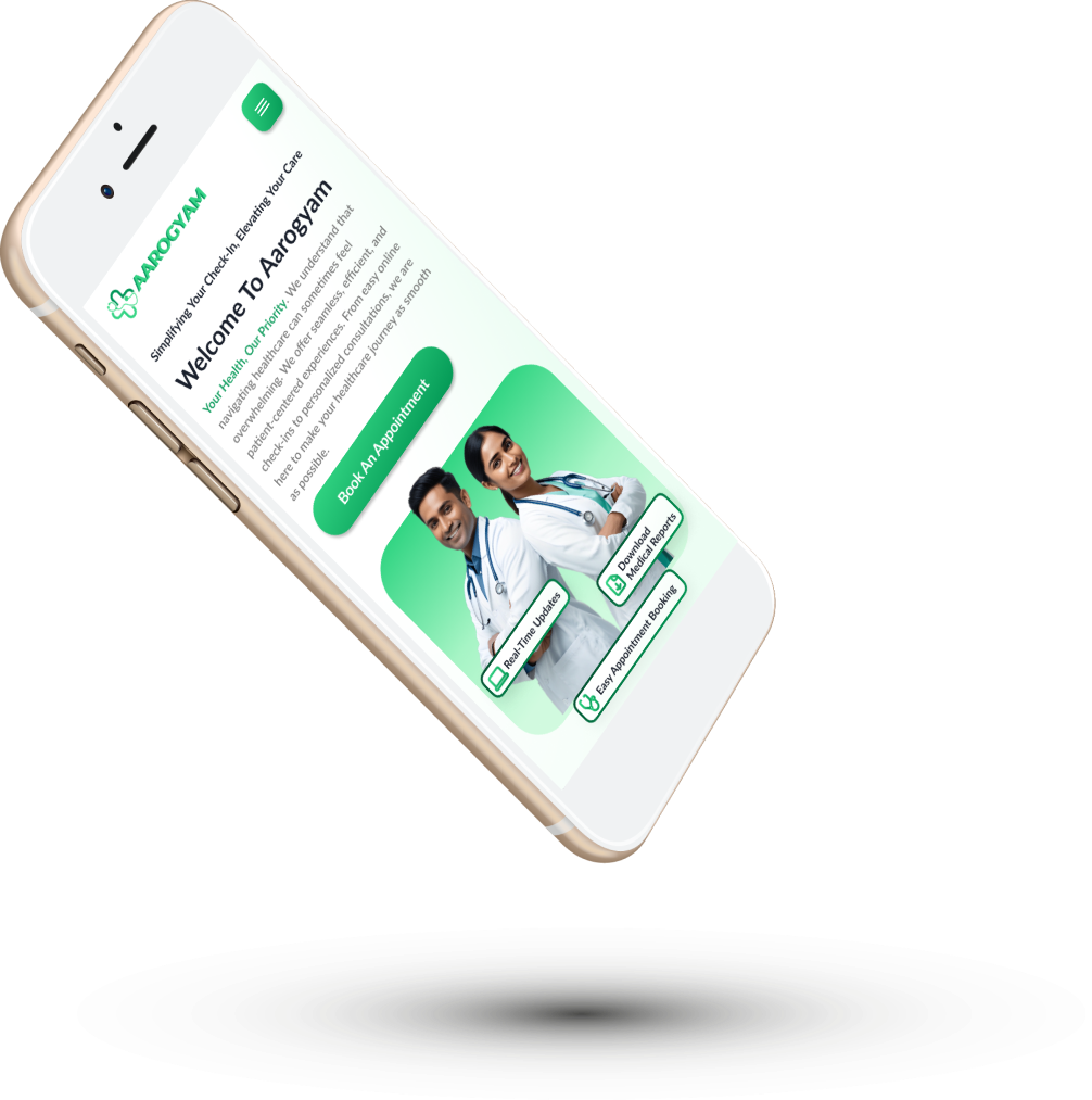
The primary goal of this project is to design and develop a responsive, patient-centered check-in website that streamlines the check-in process for family doctor visits. The system will provide a mobile-friendly, secure, and accessible platform where patients can check in, complete health screening questions, and receive real-time wait time updates.
Brainstorming
User Persona - Sunil Verma
Sunil is a retired bank clerk from Pune, finds most digital interfaces confusing and prefers simplicity. He appreciates clear, large text and step-by-step guidance on the responsive check-in website. Sunil becomes frustrated with complicated processes and values an experience that allows him to complete check-ins and health screenings confidently and independently.
“I’m not very comfortable with technology, so I need something that’s easy to understand and doesn’t confuse me.”
- Age - 60
- Education - Graduate (B.COM)
- Hometown - Pune, India
- Family - Married, 2 Adult Children
- Occupation - Retired Bank Clerk
- Complete the check-in process without needing to ask for help from his children or others.
- Clearly understand the health screening questions and how to answer them.
- Fear of making mistakes or missing something important due to his lack of familiarity with technology.
- Websites with small text, unclear instructions, or too many steps.
Usability Study
To ensure a seamless and user-friendly experience, we conducted two rounds of usability studies focusing on the check-in process, appointment booking, and health screening flow.
Usability Study (Round - 1)
In Round 1, users faced challenges with navigation, readability, and frustration with repeatedly filling out the health screening form. Based on these insights, we made key design improvements.
Round 1 Findings
Lack of a clear progress indicator and visual cues in the appointment booking process.
Users could not edit entries, changes causing frustration.
Users were trapped in the appointment flow with no option to return to the previous screen.
Usability Study (Round - 2)
Round 2 showed significant enhancements, with users finding the navigation more intuitive, text more readable, and the overall experience smoother and more efficient.
Round 2 Findings
Providing visual guidance through progress indicators helped reduce confusion.
Edit icons were introduced for users to make last-minute changes.
The “Back” button ensured a smoother, frustration-free experience during navigation.
Key Takeaways
Impact
This project simplified the patient check-in and appointment process, reducing waiting time and form-filling frustration. It improved accessibility, made booking faster
What I Learnt
I realized how visual cues in design like progress indicators, clear navigation, and accessibility can greatly improve user confidence.